A living brand: Say hello to our new logo and product identity system


When Unity formed almost two decades ago, we were a one-product company serving just the indie games sector. Today, we market more than 50 products and services to millions of developers, creators, and operators across a wide range of industries. Our new branding better reflects who we are, the evolution of our products, and where we’re going – and this is just the first of a number of exciting brand updates we’re rolling out in the coming months and into next year.
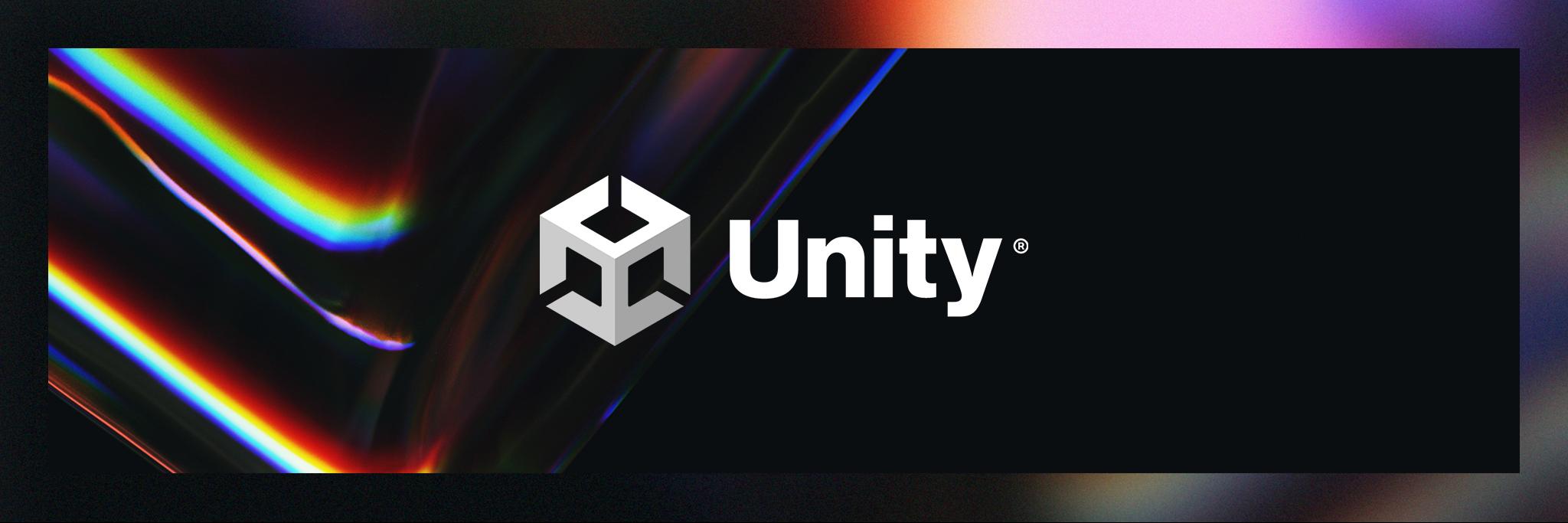
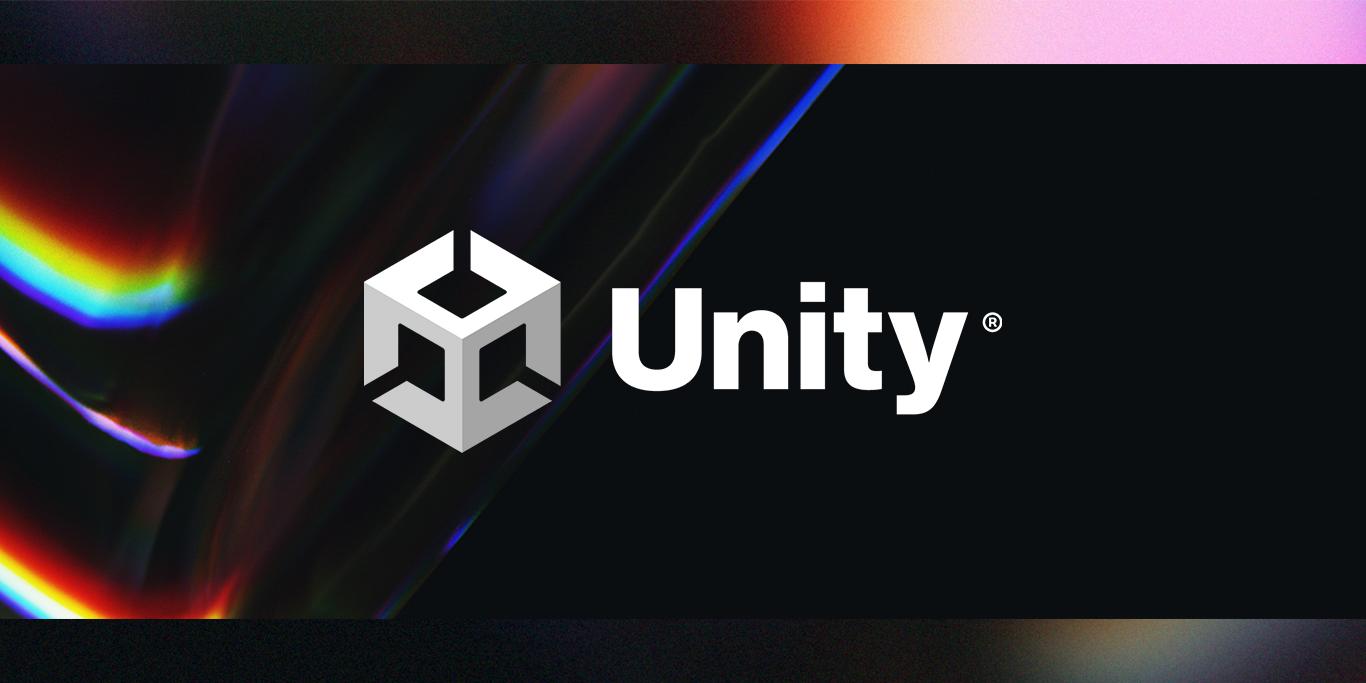
A reimagined Unity logo
While we’ve made incremental design changes to our logo over the years, we knew it was time for a more dynamic, expressive, and adaptable version. That’s why we redesigned the logo’s two main components – the Unity cube and the Unity wordmark.
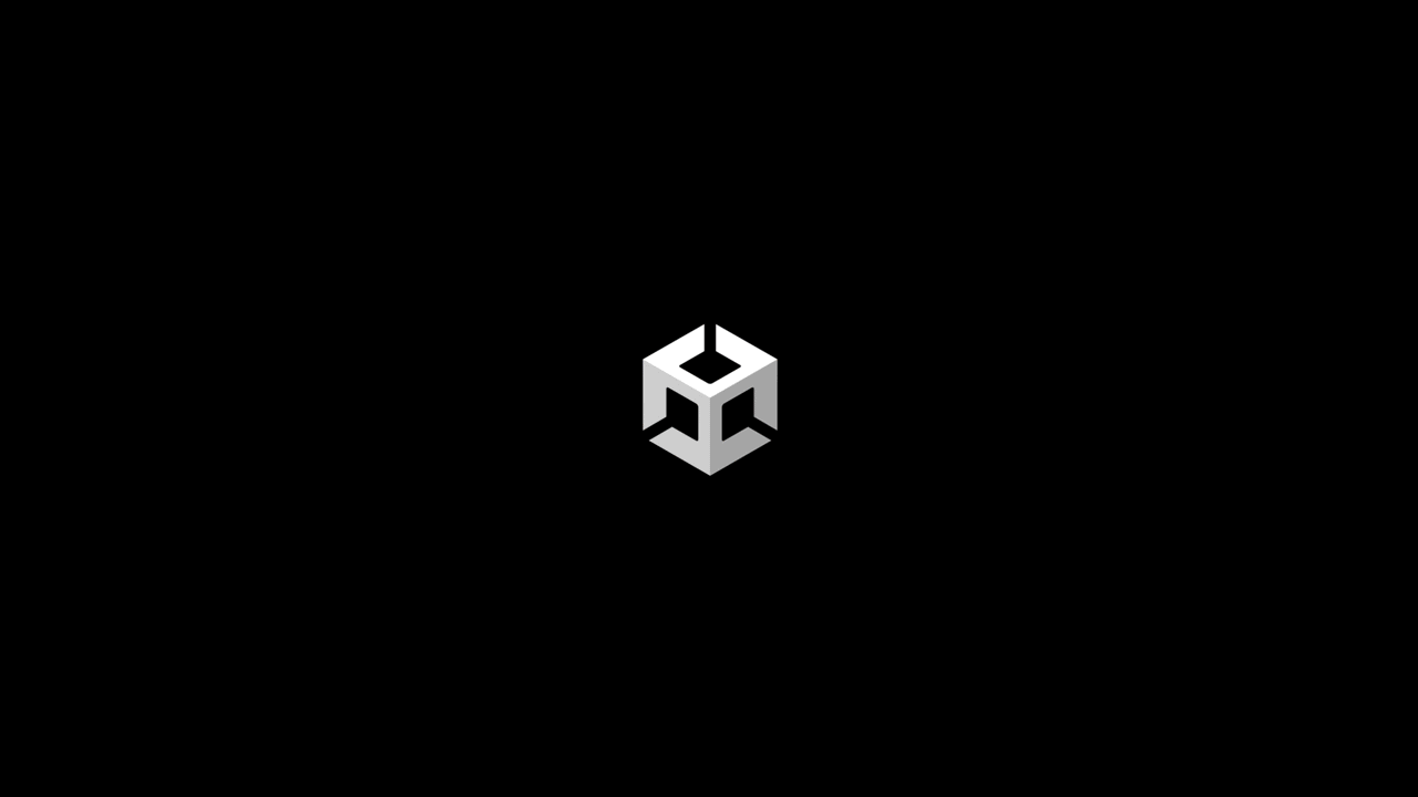
A truly three-dimensional Unity cube
To start, we completely redesigned the cube while retaining the essence and equity of the original. It’s now fully 3D; symbolically, it’s where our technology (the X axis), Unity creators (the Y axis), and the incredible experiences they create (Z axis) intersect.
Importantly, we designed this new identity to reflect our living brand – a brand that leaves no creators behind as it supports and celebrates opportunity and diversity for all. Notice the three directional arrows: they represent the infinite possibilities that Unity puts in the hands of all who use our solutions.
The updated cube also serves as the foundation for our new product branding and will be cascaded throughout our real-time 3D development platform and across our entire product catalog.
And here’s the new Unity wordmark
Next, we made subtle changes to the wordmark – a bit of kerning here and tracking there but most importantly, we have capitalized the letter U, giving the wordmark more maturity. The registered symbol is new, too.
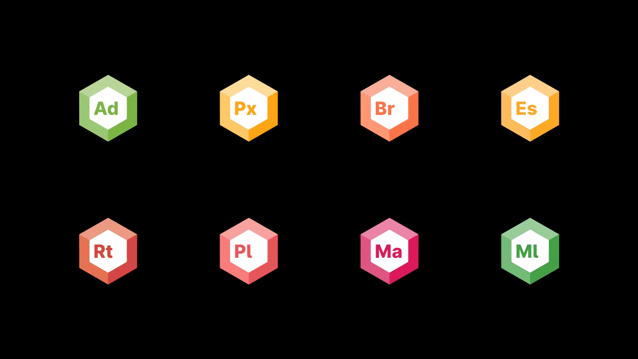
A new Unity product identity system
Our fully integrated and cohesive product identity system is based on the new logo design. This makes it easier for our users to identify and find the products they need, and better understand our product hierarchy and the relationships of connected Unity products.
Animated 3D logos
Since Unity is the leader in real-time 3D (RT3D) technology, our products bring projects alive for different users, applications, and use cases. That’s why we’ve animated the new 3D product logos for our primary products.
The new branding rollout
As of today, the new logo appears across our website and social media channels, and we are currently integrating the new branding into Unity and our product lines. Over the coming months and into next year, the new branding will appear on Unity products, services, collateral, and swag, to name a few of our brand touchpoints.
Want to know more or tell others?
Is this article helpful for you?
Thank you for your feedback!
- Unity Labs
- Copyright © 2024 Unity Technologies